


7 Packaging Design Lessons from the Pros

Imagine you are in a pitch competition for your CPG brand that works like this:
You are sharing the pitch stage with hundreds of other brands at the same time.
Your panel of judges is made up of everyday people, who happen to have just gotten off work and have kids in tow. They also are thinking of 20 other things going on in their lives.
If you happen to get your judges’ attention at all, you then have about 3 seconds and 5-10 words to communicate what is so amazing about your product.
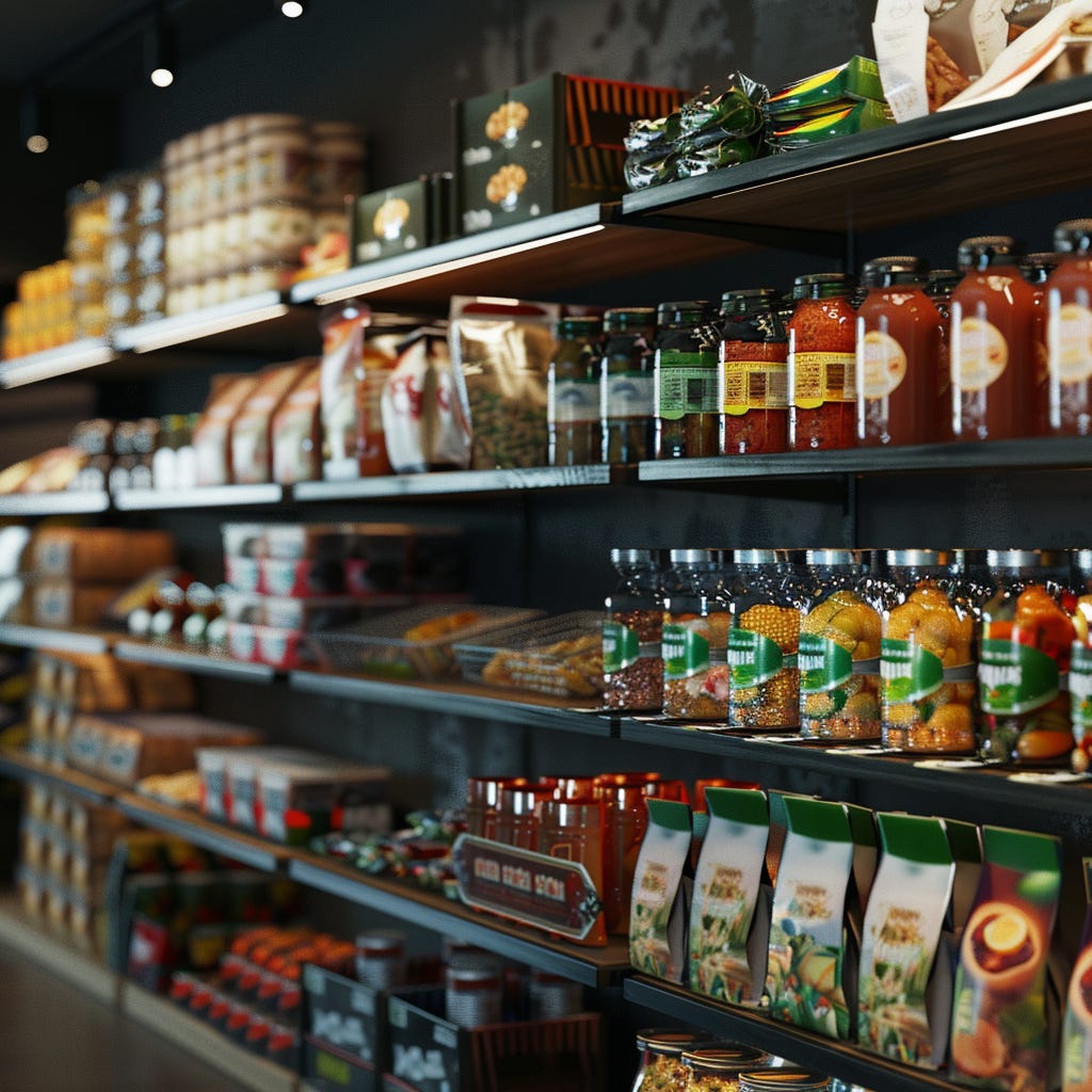
How does that sound? Would you sign up for that? Chances are you already have because what I described is not a pitch competition—it is what your packaging experiences every day on retail shelves.
Getting people to try your product is, no doubt, key to success in CPG. That was the main reason I wrote 40 ways to drive trial. But the truth is, most people will not become aware of your brand through samples or other methods. Most people will learn about your brand by seeing it on the shelf. This makes packaging one of the best investments you can make in your CPG.
Knowing this, I interviewed a couple experts to get a few pointers when it comes to package design.
Before I jump in I wanted to give a big thanks to, and share a little about, my collaborators:
Nancy Frame
Nancy has over 30 years of experience in CPG package design and is the designer of the original Whole Foods 365 branding and logo. Her design firm, Nancy Frame Design has created brand marks, packaging, and environmental design for a range of clients including Whole Foods Market, Applegate Farms, Earth Fare, Fairway Market, Chiquita Brands, Popsicle Industries, Kraft Foods, and many more. Few designers have the tenure, breadth, and depth in packaging design that Nancy does.
You can find Nancy at her website.
Or on LinkedIn.
Andy Kurtts
Andy is the creative director and founder of Buttermilk Creative, a CPG packaging design firm he started nearly a decade ago. He is also a mentor for branding & packaging design at the SKU accelerator where he advises CPGs on their branding, packaging, storytelling, website experience, and overall design strategy. Andy has been designing CPG packaging for nearly 17 years and has worked extensively across both private label and branded products.
You can find Andy at his website.
Or on LinkedIn.
You can also check out his podcast here.
Alright, let’s dig in!
#1 Don’t Over-emphasize Brand Name in Early Stages
“Honestly, especially if you're a new startup brand, your brand name really doesn't matter all that much… What really needs to come over is the product —what the flavor is and why I want to buy it.”
- Andy Kurtts
If you are a newer brand, it’s tempting to try and “build a brand” and make your logo large on pack. But brands aren’t built that way. They are built by delivering an amazing experience whether it be functional, emotional, or social.
The brand recognition will come once you get people to pick the product off the shelf and then provide a great product experience. A strong brand is an outcome of providing value rather than large, cool typography on pack.

Andy elaborated by saying,
“The FDA has you do certain things with the product name when it's sized with the product identifier… so there's a certain proportion that you have to follow, but, I think a lot of [new] brands get hung up on having the big logo on there and then minimizing the product identifier and flavor name. [They think], Oh, it's our brand, we're branding, we're building a brand.
You are, but it's not the right time yet. You really need to get people to want to buy your product. [Either] it's made them hungry or it's speaking to them in some way because of some health claim, flavor, imagery, etc. That's the stuff that's going to stand out.
Then you have to fulfill [the label’s] promise when they get home and actually eat it. [Hopefully they think], ooh, this is good, look at your package [more closely] and add it to the grocery list for next week.
It doesn't mean that you have to make it minuscule, but when you're starting off, it's not the most important thing.”
#2 Get Your Prototype On the Shelf
Packaging doesn't work in a vacuum. It may look amazing on the computer screen or even coming off the line at the co-packer but once you get it under those florescent lights at the typical grocery store, things may look very different. There are things you can only learn by getting it on the shelf.
Nancy recommends brands take prototypes to stores, place them on the shelf and snap some photos. When she does this she's looking to see if the packaging is noticeable when sitting beside other products in the category but she's also watching for small things like anything that might obscure important messaging on pack such as sale tags on the shelf above. She studies it and makes sure the design works in the wild.
#3 Consumers Should Feel Your Packaging in the Back of Their Jaw
After all, we’re selling food here. No matter what people say about wanting to eat healthy, taste and hunger are biological aspects of being human. Andy recommends brands design with this in mind. He says consumers should feel your packaging, “in the back of their jaw” and that imagery can go a long way here.
#4 Think About the Design System
“As designers, we never want to paint ourselves into a corner. Your client may want to add an orange flavor to their line. So you need to start thinking about how the design can expand to other flavors or configurations in the beginning.”
- Nancy Frame

Nancy and Andy both worked on private label products for many years and in those cases they had to be very intentional about the design system itself. In private label you are designing a brand that is going to cross a huge range of products with different flavors and pack sizes. You aren’t likely designing for that level of breadth but you need consider how far your brand might extend and how your design patterns will work across the different products you plan to create. As an example Nancy described a recent project this way,
“We just wrapped up designing a body care line that includes hand & body lotions, lip balms and deodorants. [CPG teams need to] see all those different configurations and make sure that the new system will work with all those different sizes. It's important for a designer to know as much as possible about the brand's future plans at the start of a project.”
#5 Keep Flavor and Product Names Simple
Andy recommends not getting too crazy with your flavor names. He explains that you only get a few seconds of attention from each customer and you want to communicate quickly what you are offering. Yes, you can name your flavor Unicorn Magic or Fairy Dust but you are not doing your customer, or yourself, any favors.
#6 Design for the Consumer’s Taste, Not Your Own
When designing a new product it is tempting to cater to your own tastes and worldviews. But, Nancy says this is a common pitfall. Founders need to exercise restraint to create package design around their consumer’s tastes instead of their own. You may hate certain styles or imagery but if you aren't the exact target consumer, you will want to bend.
#7 Match Flavor Names with Your Demographic
The same flavor can be described differently depending on your audience. Andy gave the example of sun-dried tomato vs pizza. Sun-dried tomato and pizza can be essentially the same flavors, but sun-dried tomatoes might have a greater appeal for an older consumer whereas pizza would likely appeal to a younger consumer.
Andy suggests brands are, “clear eyed and focused on what their product is and what the flavor name is and that it's appropriate to your target audience and customer”.
Take care,
Jordon ✌️
A good one!